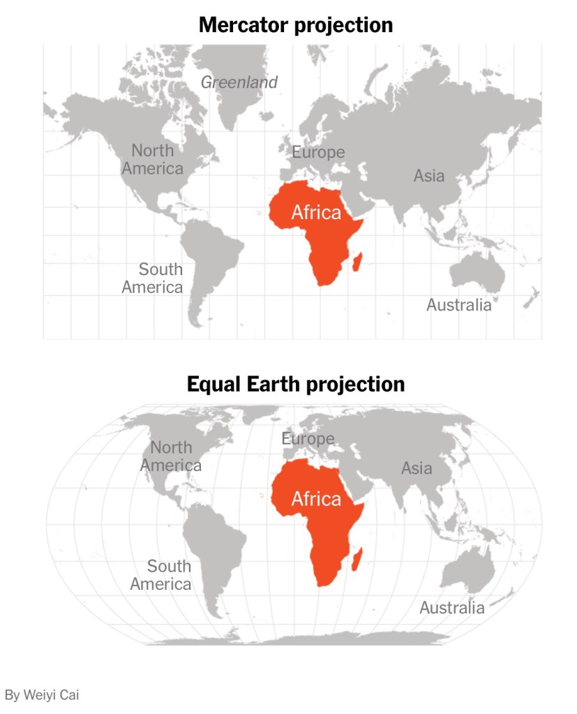
Africa is roughly three times as large as Europe, but you wouldn’t know it looking at the world’s most popular map, the 16th-century Mercator map.
Last week, the African Union, a continental group of 55 countries, endorsed a campaign to have organizations around the world replace the Mercator map with alternatives such as the 2018 Equal Earth projection, which supporters say more accurately reflects the true size of Africa.
In the Equal Earth map, Africa, shown in its true proportions, dwarfs Europe….
“It is more than geography, it’s really about dignity and pride [and accuracy],” said Fara Ndiaye, co-founder and deputy executive director of Speak Up Africa. “Maps shape how we see the world, and also how power is perceived. So by correcting the map, we also correct the global narrative about Africa.”

Leave a comment